Science matters. While there aren’t many climate change skeptics any more, unless you belong to the Republican Party, it is worthwhile to see graphically what is happening to our planet’s atmosphere so we can be confident of the rationale for demanding aggressive action to avoid the worst consequences that a quickly warming climate will cause. So short and to the point today. A quick look at the following chart makes clear what and how quickly we humans have increased the world’s temperature by pumping climate warming elements into the atmosphere. Hopefully this makes you realize how urgent and scary is our predicament and motivate you to advocate loud and clear that we must take drastic action to avert the worst, or even the bad, case scenario that we will otherwise experience.
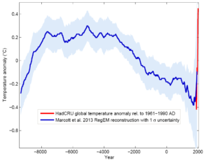
On the graph, the x-axis is years (zero is where the Common Era begins ~2,000 years ago), the y-axis is temperature. The dotted lines represent the Holocene period. This encompasses more time than the “hockey stick.” We’re entering a new period. Huge changes are occurring (youalready knew that)…